


 0
0
How much do you rely on mobile apps to ease your daily tasks? It turns out that mobile users spend 4.2 hours a day (on average) on mobile apps — chatting with friends, listening to music, learning a new language, keeping up with the latest news, paying bills, or tracking physical activity and health.
With around nine million apps currently on the market and thousands more appearing every day, developing a powerful, feature-packed, and reliable mobile app is imperative if you want your product to stand out from the crowd.
Yet, creating a triumphant mobile app begins with mastering the basics of mobile UI. It’s about executing the fundamentals of User Interface design for mobile apps — an aesthetic, minimal design that prioritizes consistency and comprehension, simultaneously ensuring details such as typography, color schemes, white space, and content complement the overall story.
Achieving and maintaining the basics of UI design — simplicity and visual hierarchy — in your mobile app design should be your starting point, and the ultimate goal.
Why?
First, simplicity is aesthetically pleasing and makes the app more accessible and intuitive. In addition, a simple design allows users to get things done efficiently, and requires less instruction and support.
On the other hand, visual hierarchy defines the significance of elements based on their sequence within a composition. In other words, a hierarchical UI design leads the viewer throughout the entire app and its components, generating different levels of priority and intuitive flow.
Why achieving balance is important in mobile app design
The app design process starts with a blank canvas, to which elements such as text, images, graphics, buttons, alignments, color schemes, white space, and others are added. All these should contribute toward creating a harmonious, aesthetic, and intuitive mobile app design.
Out of all these elements, text and graphics are by far the two most important. This is because the text provides us with much-needed information and details, whereas visuals appeal to our senses and promote our understanding of ideas and concepts. Finding balance between these two is imperative, as an app with excessive text risks fatiguing the readers, while too many images and videos can be distracting.
Striking the perfect balance yields an intuitive, appealing, and user-friendly app design with little cognitive load and an effortless user path to reaching their goals.
How to nail the right graphics-text balance for you mobile app
Before uncovering the UI tips all mobile apps developers should know, we should discuss what balance entails. Balance is not necessarily about symmetry — asymmetrical and seemingly “out of balance” design can still be harmonious, balanced, and attractive.
Balancing text and graphics is not about equalling their alignment and ratio — not even colors and styles. Instead, it is about treating the elements as separate entities while at the same time establishing a relationship between the two.
Simplicity and visual hierarchy play a crucial part in balancing these elements. The first guides the relationship between the texts and visuals so that the design remains straightforward and information-based. In contrast, the latter determines which feature is the focal point and that will lead the user to attain their ultimate goal within the app.
Now, let’s dive into the expert tips for marrying text and graphics in your mobile app UI design.
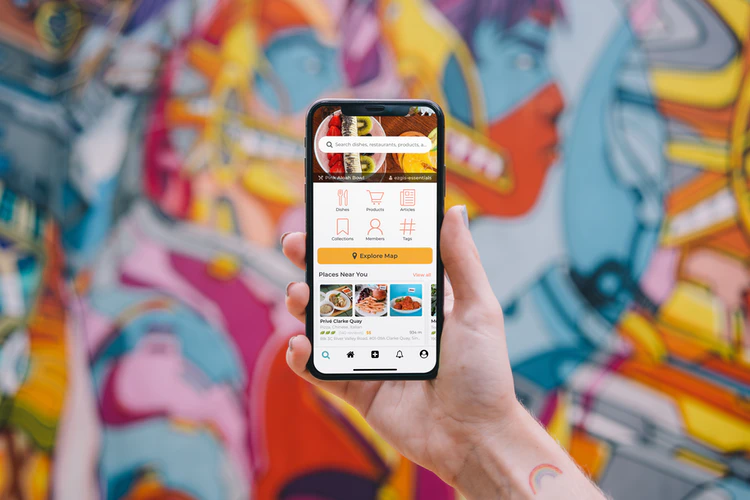
Source: Unsplash
Understanding visual grammar
The concept of visual grammar aims to define the basic elements of design, describe their patterns and processes, and understand their mutual relationship within a single system. Grasping the ideas behind color, symmetry, the visual weight of elements, and other design concepts will improve your understanding of what makes good app design.
Moreover, comprehending the five fundamental principles of app design — concepts equally utilized across custom web development and design — and their correlation on a user’s mobile screen can improve how your apps match users’ intuition:
Scale
The bigger the element — the greater the significance it has.
Scale is a factor that determines the value of a certain element relative to others in its shape, size, order of appearance and other factors. Usually, the text should be smaller than your graphics, but that is just a rule of thumb.
Visual hierarchy
Visual hierarchy refers to how the combination and sequence of text and images guides the users throughout the app and builds the narrative.
Symmetry
Even though asymmetrical designs can be harmonious and appealing, creating symmetry between texts and graphics is always safe and certainly yields satisfactory results.
Contrast
Creating contrast in element size, shape, color, or placement helps all elements stand out without competing against each other.
Coherence
While observing all the individual UI elements is crucial for success, combining everything into a larger, unified picture is equally important.
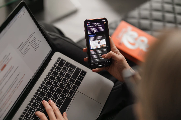
Source: Unsplash
Identify design goals
How do Instagram and New York Times apps’ looks differ? Well, the first is focused on the visual content, whereas the latter prioritizes text. Obviously, both apps identified their respective goals and designed accordingly. Defining your app’s purpose and target users is crucial prior to starting the design process. Identifying the app goals will be beneficial for choosing the right elements, but it will also help in balancing out the text and graphics ratio.
Create a mind map or storyboard
The best way to achieve hierarchy is to create it yourself. Visualizing users’ paths throughout your app highlights the pain points of app design and fosters improvements during the development process.
Mind mapping and storyboards are great ways to prototype your product. They enable you to picture user interaction with the app and to formulate a narrative that demonstrates a person’s experience of your product.
Consider composition and establish a focal point
Balancing the text and graphic elements of your app guides users’ attention to where you want it. Whether it’s a CTA button, a new product offer, or an article from your blog, properly combining text and visuals yields amazing results. Feature the app features you want to focus on, and organize the remaining elements so that they lead your user to take the right action.
Choose the right image
When we say “the right image,” what we mean is opting for an image that complements the app’s overall design and text regarding the tone, context, emotion, style, etc. Moreover, balancing the image with the remaining visual elements and texts calls for careful consideration of how crowded and colorful the image will be.
Create a background for your text
Using analogous color schemes, or generally, a color combination with poor contrast can make it hard for users to read text — this is especially true for those with visual impairments. Reducing the app’s accessibility can keep users from completing tasks or even coming back. If your image doesn’t have an empty space to place your text, you can add a background shape, a transparent color overlay, or lighten or darken the photo to make the text stand out.
Achieving balance
Poor organization of app elements leads to an imbalanced and ineffective design. So, a layout that is too cluttered, where spacing or alignment is off, or is visually heavy only on one side, is considered a bad composition. Establishing a balance between textual and graphic elements is even more important in simple, minimalistic designs, as any poorly executed design choices will be more obvious.
Testing, improving, and repeating
Integrating feedback at every step is vital to improving and honing your app design. From ideation all the way through beta release it’s important to seek input and iterate on that feedback. Optimizing for best performance and user experience is an ongoing process. Trends change, your competition improves, and customer needs evolve. Take the pulse of your users and use their invaluable feedback to refine your app’s design.
Conclusion
With so many possibilities in your design process — colors, layouts, typography, and so on — it is easy to slip the fundamental concepts of app design from your mind. However, achieving simplicity and visual hierarchy should be your main design goal, not only for the aesthetics but also for guiding the users to complete the desired action. Implementing user feedback is vital to improving your app’s performance and UX, and will help create a design that nurtures your app’s goals.


